
Why Taupe Color Is the Perfect Neutral
Taupe color is a versatile and timeless neutral that blends gray and brown to create a balanced, elegant tone suitable for both interior design and fashion. Known for its adaptability, taupe complements a wide range of colors—from soft pastels to bold jewel tones—while offering calming and sophisticated aesthetics. With various shades like greige, mushroom, and mocha, taupe remains a go-to choice for creating harmonious color schemes that enhance style without overpowering a space.
What makes taupe stand out among other neutrals? Its unique ability to harmonize with numerous shades allows it to shine without overwhelming its surroundings. With soft undertones that evoke warmth yet retain sophistication, this earthy tone has become a go-to choice for those aiming for timeless elegance.
In this article, we’ll explore everything about taupe color—from its rich palette of shades and complementary colors to similar hues you might want to consider. Get ready to discover why taupe should be on your radar as the ultimate neutral!
Why Taupe Color Is the Perfect Neutral
Taupe color stands out as a true champion among neutrals. Its unique blend of gray and brown creates an earthy tone that feels both warm and sophisticated. This captivating hue has the remarkable ability to enhance any space or outfit without overshadowing other elements.
One reason taupe is so appealing is its versatility. It works seamlessly with a variety of styles, from rustic farmhouse to sleek modern aesthetics. Whether you’re going for cozy comfort or chic elegance, taupe adapts beautifully.
In addition, taupe complements a wide range of colors, making it easy to incorporate into your existing palette. Pair it with soft pastels for a light-hearted vibe or bold jewel tones for striking contrast—the options are endless. This adaptability allows designers and homeowners alike to experiment freely while maintaining balance.
Another aspect that makes taupe special is its timeless quality. Unlike trendy shades that may fade away in popularity, taupe remains relevant across seasons and styles. It embodies classic beauty without feeling stale or outdated.
The calming effect of taupe cannot be overstated either. Its muted tones create an inviting atmosphere conducive to relaxation—a perfect backdrop for serene spaces like bedrooms and living rooms where tranquility reigns supreme.
Moreover, incorporating this color into your wardrobe can elevate your fashion game effortlessly. A well-chosen piece in taupe can become a staple item—easy to dress up or down depending on the occasion.
Taupe’s understated elegance signifies sophistication without being overly flashy; it’s the quiet confidence we all aspire toward in our homes and lives.
Shades of Taupe Color Palette
Taupe is a versatile hue that sits comfortably between brown and gray, making it an ideal choice for various design aesthetics. The beauty of taupe lies in its ability to adapt, offering shades that range from warm to cool tones. This flexibility allows it to blend seamlessly into any space.
The lightest shades are often referred to as “greige,” combining the qualities of both gray and beige. These soft, airy colors create a serene atmosphere in rooms filled with natural light. They work beautifully in modern or minimalist settings where simplicity reigns supreme.
Moving further down the spectrum, medium taupes introduce more depth while remaining understated. These shades can serve as excellent backdrops for bolder accents without overwhelming them. Medium taupe brings warmth and balance into living spaces, striking just the right chord between comfort and sophistication.
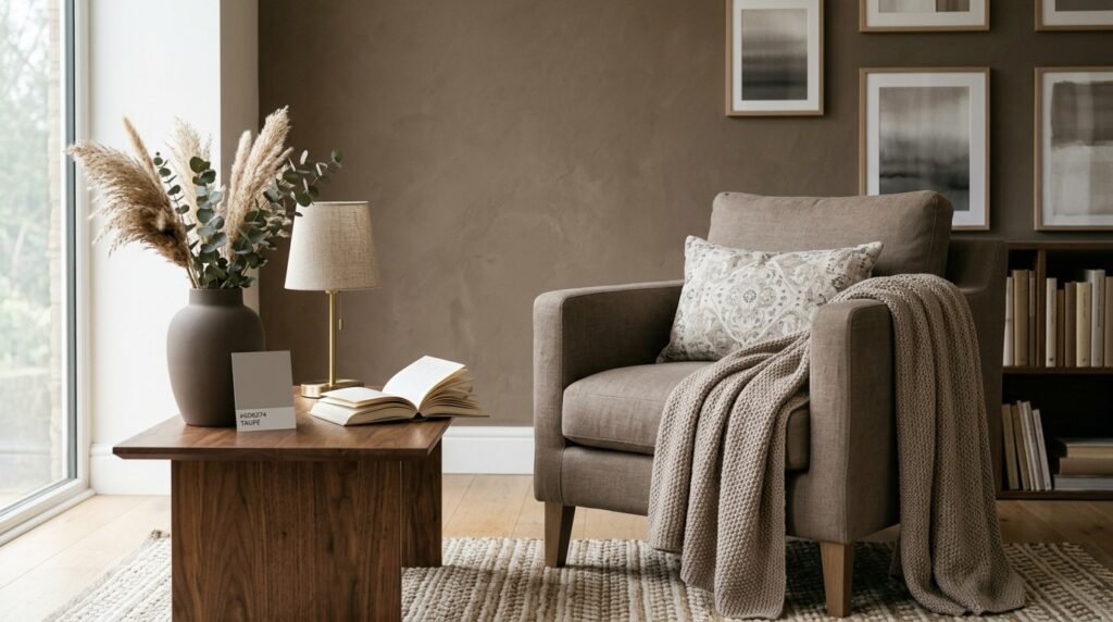
Darker taupes delve deeper into earthy territory, evoking feelings of coziness and stability. Richer tones add drama and elegance when used on walls or furniture pieces like sofas or armchairs. They provide a grounding effect that complements bright hues effectively.
Each shade has its unique character; some may lean towards lavender undertones while others embrace warmer golden notes. This diverse palette makes it easy to find the perfect variant for your needs or preferences.
When paired with other colors—like muted greens or soft blushes—taupe enhances their beauty without competing for attention. It creates harmonious combinations that breathe life into interiors or fashion choices alike.
Whether you’re designing your home or curating your wardrobe, exploring different shades of taupe can unlock endless possibilities tailored just for you.
What colors go with taupe?
Taupe is a versatile color that plays well with many shades. Its unique blend of gray and brown makes it a fantastic backdrop for various palettes. When you think about colors that pair beautifully with taupe, the possibilities seem endless.
Soft pastels are an excellent choice to complement taupe’s muted tones. Light pinks, mint greens, and baby blues can create a soft and inviting atmosphere. These gentle hues add freshness without overwhelming the calming essence of taupe.
For those who prefer bolder combinations, deep jewel tones work wonders too. Rich emerald greens or sapphire blues can create striking contrasts against taupe’s warm undertones. This pairing brings depth and sophistication to any space.
If you’re looking to maintain an earthy vibe, consider using olive green or terracotta alongside taupe. These natural shades enhance the organic feel while creating warmth in your design scheme.
White offers a clean contrast that brightens up any room adorned with taupe elements. Crisp whites highlight the nuances of this neutral color without competing for attention.
For a more dramatic look, charcoal gray adds depth when paired with taupe. The interplay between these two neutrals can elevate modern designs while keeping things stylishly understated.
Metallic accents like gold or copper bring glamour into play when mixed with taupe colors. They add just the right amount of shine and texture to make your palette pop elegantly without losing its refined charm.
What are similar colors to taupe?
When exploring colors similar to taupe, it’s clear that this versatile hue has many companions. One of the closest variations is greige, a mix of gray and beige. Greige captures the warmth of taupe while adding a contemporary twist, making it popular in modern decor.
Another shade worth mentioning is mushroom. This earthy tone leans slightly darker than taupe but retains that neutral quality. Mushroom adds depth to color palettes without overpowering other hues in your space.
Sand is another lovely alternative to consider. It brings in soft golden undertones and maintains an airy feel reminiscent of beach vibes. Sand works beautifully when paired with whites or light blues for a serene atmosphere.
Stone is also closely aligned with taupe’s characteristics. With its cool gray tones infused with warm beiges, stone creates an elegant yet understated backdrop ideal for both traditional and modern settings.
For those seeking something richer, try mocha. This deep brownish-gray offers warmth and sophistication while still being neutral enough to blend seamlessly into various designs.
If you want a lighter option, consider cream or off-white shades like ivory or eggshell as they share some similarities with taupe’s softness but offer more brightness to spaces needing illumination.
Driftwood can be seen as a rustic cousin of taupe; it’s muted yet holds character that resonates well within nature-inspired themes. These shades provide plenty of options for creating harmonious schemes alongside the beloved taupe color.
Everything about the color taupe
Taupe is a color that often intrigues with its blend of warmth and neutrality. It’s a sophisticated hue between brown and gray, creating a subtle yet striking presence in any space. Taupe can evoke feelings of comfort, making it an ideal choice for home décor.
One of the fascinating aspects of taupe is its versatility. This color adapts seamlessly to various styles, from modern minimalism to rustic charm. Whether you’re aiming for an elegant living room or a cozy bedroom, taupe serves as a perfect backdrop.
The beauty of taupe lies in its ability to shift depending on lighting and surrounding colors. In natural light, it appears warmer with hints of beige; under artificial lights, it may lean more towards gray tones. This adaptability makes it an excellent choice for different rooms throughout your home.
When considering taupe in design schemes, it’s essential to note how effectively it complements other colors. Its neutral nature allows bold hues like emerald green or deep navy blue to stand out while providing balance without overwhelming the senses.
In fashion, taupe has been embraced as a staple shade that pairs beautifully with various textures and patterns. From chic trench coats to stylish handbags, this color offers timeless elegance that transcends seasons.
Beyond aesthetics, the psychological impact of taupe cannot be ignored. The softness associated with this shade can promote relaxation and calmness—a factor many consider when designing personal spaces where they spend ample time.
Understanding taupe’s origins adds another layer to its allure—this unique name comes from the French word for “mole,” inspired by the earthy tone found in these small animals’ fur coats. Such historical context enriches our appreciation for this remarkable neutral hue.
Taupe Color Schemes
Taupe color schemes offer versatility that can transform any space. This neutral hue seamlessly blends with various palettes, making it a favorite among designers and homeowners alike. Its understated elegance creates a calming backdrop or serves as the perfect accent.
Pairing taupe with warm colors like terracotta or burnt orange adds depth to your environment. These combinations evoke feelings of coziness, ideal for living rooms or bedrooms where relaxation is essential. The warmth of these shades complements taupe’s earthy tones beautifully.
For a more contemporary vibe, consider teaming taupe with cool blues and greens. A soft turquoise against taupe can create an airy feel, reminiscent of coastal retreats. This pairing encourages tranquility while maintaining visual interest in any room.
If you desire an elegant touch, combine taupe with rich jewel tones such as emerald green or deep burgundy. These bold shades stand out against the muted nature of taupe, creating striking contrasts without overwhelming the senses.
Monochromatic schemes work well too; using varying shades of taupe can add layers to your design without introducing competing colors. Play with textures—mix smooth fabrics with rougher materials to keep things dynamic yet cohesive.
In spaces requiring sophistication and balance, pair taupe with crisp whites or blacks. This combination ensures that integrity remains at the forefront while adding chic modernity to your decor style.
Don’t forget about metallics! Gold and bronze accents alongside taupe uplift its appeal significantly by bringing warmth and glamour into play—perfect for dining areas or statement pieces around your home.
Frequently Asked Questions
When it comes to the taupe color, many questions often arise. One common inquiry is about its versatility. Taupe can seamlessly transition from casual to formal settings, making it a favorite among designers and homeowners alike.
Another popular question centers on how taupe interacts with lighting. The shade may appear warmer or cooler depending on natural light versus artificial sources, which adds an intriguing dimension to your space.
People also wonder if taupe works in small rooms. Absolutely! Taupe can create a cozy yet spacious feel when used wisely, especially paired with mirrors and strategic lighting.
What about mixing patterns? Taupe serves as an excellent base for various patterns without overwhelming them. It complements everything from floral prints to geometric designs beautifully.
Some ask whether taupe is trendy or timeless. While trends come and go, taupe has proven itself as a classic choice that stands the test of time.
Taupe’s unique characteristics make it more than just another neutral; it’s a versatile option that resonates well in various contexts—from fashion to interior design—making it an ideal choice for anyone looking to enrich their palette.