
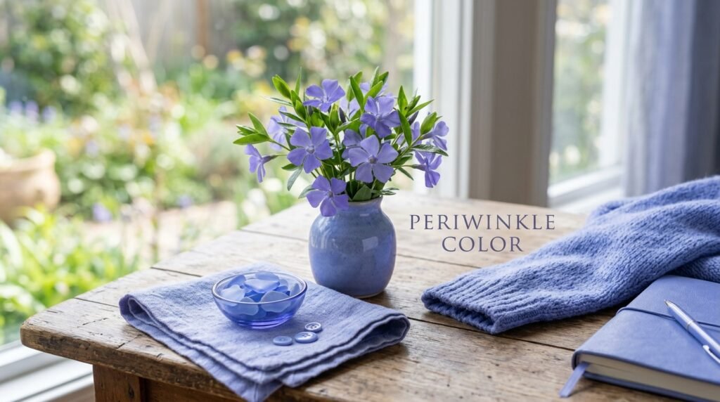
Periwinkle Color A Journey into the World of Calm
The world of art and nature is full of many colors, yet few are as calming as the periwinkle color. When you look at this shade, you are seeing a beautiful blend of light blue and soft violet. Consequently, it feels both refreshing like a clear sky and mysterious like a bunch of lavender. People often describe it as a “pastel” because it is light and airy. Because it sits right between blue and purple on the color wheel, it captures the best of both worlds. Blue brings a sense of peace, while purple adds a touch of creativity and royalty. Therefore, periwinkle is a favorite for many artists, designers, and nature lovers who want to create a relaxing mood.
Where Does the Name Come From?
Most people do not realize that the name of this color actually comes from a small plant. The periwinkle plant, also known as Vinca minor, is a creeping vine that grows close to the ground. It has dark green leaves that stay green all year, which is why people call it an “evergreen.” In the spring, the plant produces small, star-shaped flowers. These flowers are the original source of the periwinkle color. Interestingly, the word “periwinkle” comes from an Old English word, periwince. Over hundreds of years, people began using the name of the flower to describe the specific shade of its petals. Now, we use the word to talk about everything from crayons to expensive evening gowns.
The Science and Math of the Shade
Every color we see can be explained by science and numbers. In the world of computers and graphic design, we use “hex codes” to get the exact right shade. For a standard periwinkle color, the hex code is often listed as #CCCCFF. This code tells a computer exactly how much red, green, and blue to mix together. In this case, the mix has a lot of blue and just enough red to give it that purple tint. Furthermore, if we look at the physics of light, every color has a wavelength. Blue light has shorter waves, and violet has even shorter ones. Since periwinkle is a mix of both, it sits in a very high-energy part of the visible light spectrum. Even though it looks soft to our eyes, the science behind it is quite powerful.
The Meaning and Symbolism of Periwinkle
Colors often make us feel certain emotions, and this is known as color psychology. The periwinkle color is famous for representing serenity and peace. Because it is so light, it does not feel heavy or sad. Instead, it feels hopeful. In history, people linked the periwinkle flower to “everlasting love” and “cherished friendship.” This is likely because the plant is so hardy and stays green even in the winter. In some cultures, it is a symbol of memory and nostalgia. It reminds people of happy times from their childhood or a peaceful garden they once visited. Thus, when someone gives you a gift in this color, they might be saying that your friendship is special and will last a long time.
Using Periwinkle in Interior Design
If you want to make a room feel bigger and more relaxing, the periwinkle color is an excellent choice. Interior designers often use it in bedrooms because it helps people fall asleep faster. Since the color is not as cold as plain blue, it feels cozy. You can use it on a large “accent wall” to make the room stand out. On the other hand, you can just use small touches like pillows, blankets, or curtains. Periwinkle looks amazing when you pair it with crisp white furniture. Additionally, it works well with light gray or even soft “mint green.” For a more modern look, some designers mix it with gold or brass accents. This makes the soft color look very fancy and elegant.
Periwinkle in the World of Fashion
Fashion trends change every year, but the periwinkle color never truly goes out of style. In 2022, a very famous company called Pantone even named a shade of periwinkle called “Very Peri” as the Color of the Year. This made the color appear on runways all over the world. It is a very versatile color for clothing because it looks good on almost every skin tone. For example, a periwinkle summer dress looks light and breezy for a day at the beach. Meanwhile, a periwinkle tie or scarf can add a pop of color to a boring gray suit. Because it is a “cool” color, it is especially popular during the spring and summer months when the weather is warm.
Nature’s Other Periwinkles
While the flower is the most famous example, nature has other versions of this shade. Have you ever heard of the “periwinkle snail”? These are small sea snails found along rocky shores. While their shells are often more gray or brown, they are named after the same word. Moreover, if you look at the sky just before the sun fully sets or right before it rises, you might see a “periwinkle” glow. This happens because the Earth’s atmosphere scatters the light in a specific way. It is a magical moment that many photographers try to capture. Finding the periwinkle color in the wild reminds us how much beauty there is in the small details of our planet.
How to Mix Periwinkle Color Paint
If you are an artist, you might want to create your own periwinkle color on a palette. To do this, you do not just buy a tube of periwinkle. Instead, you can have fun mixing it yourself. First, you start with a lot of white paint. Second, you add a small amount of light blue. Third, you add a tiny drop of red or violet. You must be very careful not to add too much red, or the color will turn into a dark purple. If you keep it light and “milky,” you will get that perfect periwinkle look. Experimenting with different amounts of blue and violet can help you find the exact shade that you like best for your painting.
Periwinkle Color in Art History
Throughout history, painters have used various shades to show light and shadow. While the periwinkle color might not have been as famous as “royal blue” in the past, it still appeared in many Impressionist paintings. Artists like Claude Monet loved using soft blues and purples to show the reflection of water and the sky. They realized that shadows are rarely just black; they are often full of colors like periwinkle. By using these soft tones, they could make their paintings look more realistic and full of light. Today, digital artists use this color in “vaporwave” art or “aesthetic” designs because it feels dreamy and futuristic.
Role of Periwinkle Color in Modern Technology
It is not just for flowers and paint; the periwinkle color is also used in technology. Many apps and websites use this shade for their buttons or backgrounds. This is because periwinkle is easy on the eyes. Unlike bright red or yellow, which can be stressful to look at for a long time, periwinkle is gentle. Therefore, it is a great choice for apps that are meant to help people relax or stay organized. When you see this color on a screen, your brain often feels more focused and less tired. It is a great example of how a color from a simple flower can end up helping us use our phones and computers more comfortably.
Why We Love This Unique Periwinkle Color
In conclusion, the periwinkle color is much more than just a mix of blue and purple. It is a color with a long history that started in the garden and moved into our homes, our clothes, and even our computer screens. It reminds us of peace, love, and beautiful memories. Whether you are painting a picture, decorating your room, or just picking out a new shirt, periwinkle is a choice that brings a little bit of calm to a busy world. Because it is so easy to love and so pretty to look at, it will likely remain a favorite for many generations to come. Next time you see a small purple-blue flower or a soft twilight sky, you will know exactly what to call it.