
Midnight Green Meaning, Shades, and Design Inspiration
Midnight green (#004953) is a deep, sophisticated color that blends elegance with calmness. Widely used in fashion, interior design, and branding, it offers versatility through its rich tones and strong psychological appeal. From creating luxurious spaces to enhancing modern visuals, midnight green stands out as a timeless and adaptable design choice.
As we delve into the world of midnight green, you’ll discover not just its meaning and significance but also how to incorporate this stunning color into your life. Whether you’re seeking inspiration for your next home decor project or looking to revamp your wardrobe with bold hues, midnight green offers endless possibilities. Join us as we explore the depths of this captivating color—from its psychological impact to practical design tips that will elevate any space or style!
Understanding #004953 Hex Color
The hex code #004953 represents the enchanting shade of midnight green. This deep, muted hue is a blend of blue and green, creating a striking balance that mirrors the beauty of nature at dusk. Its richness makes it adaptable across various design styles while maintaining its unique identity.
It often evokes feelings of calmness and serenity. It’s reminiscent of dense forests where light barely penetrates through the foliage, giving off an air of mystery. This captivating color draws people in and encourages exploration, making it ideal for creative projects.
In digital design, #004953 provides excellent contrast against lighter colors due to its depth. Whether used as a background or accent color, it adds sophistication without overwhelming other elements in your design scheme.
Furthermore, this hex color pairs beautifully with both warm and cool tones alike, offering versatility for anyone looking to make a statement without being too bold. Its understated elegance appeals to those who appreciate subtlety while still wanting their spaces or outfits to stand out effortlessly.
Color Psychology of Midnight Green
Midnight green evokes a sense of calm and tranquility. This deep, rich color resonates with nature and has the power to create a serene atmosphere. Its connection to forests and oceans brings forth feelings of grounding and stability, making it an ideal choice for spaces that require focus or relaxation.
Psychologically, midnight green is associated with balance and harmony. It encourages introspection while promoting emotional depth. When used in design or fashion, it can inspire confidence without being overly assertive. This makes it versatile for various applications—from corporate environments to cozy home interiors.
The color also embodies sophistication. Midnight green often feels luxurious when paired with complementary shades like gold or cream, giving off an elegant vibe that elevates any setting. People are drawn to its timeless quality, which transcends trends and fads.
In terms of creativity, this hue stimulates imaginative thinking by providing a calming backdrop that allows ideas to flourish organically. Whether in art or personal expression, midnight green serves as a powerful tool for those looking to explore their creative sides while maintaining serenity.
Midnight Green Design Inspirations
Midnight green is a captivating color that evokes feelings of tranquility and sophistication. Its deep, rich hue makes it an ideal choice for design projects where you want to create a sense of depth. Whether it’s in graphic design or interior spaces, midnight green can serve as a striking backdrop or an accent.
In branding, many companies use midnight green to convey stability and trustworthiness. It works well for logos and packaging designs that aim to inspire confidence while still feeling modern. Pair it with gold accents for a luxurious feel or soft pastels for a more approachable look.
When it comes to fashion, incorporating midnight green into your wardrobe can elevate any ensemble. A tailored blazer in this shade adds elegance without being too flashy. Accessories like scarves or bags also pop against lighter outfits, making them versatile pieces.
For those looking to enhance their living space, consider using midnight green on walls or furniture. It pairs beautifully with natural wood tones and neutral palettes, creating rooms that feel both cozy and refined. The versatility of this color ensures it remains timeless across trends and styles.
Utilizing Midnight Green in Design
Midnight green is a versatile color that brings sophistication to any design project. It can serve as a bold statement or an elegant accent, depending on how it’s utilized. When used in branding, this rich hue conveys depth and reliability, making it ideal for businesses that want to evoke trust.
In graphic design, midnight green pairs beautifully with lighter colors like soft creams or muted golds. This combination creates striking visuals that grab attention without overwhelming the viewer. For user interfaces, using midnight green as a background can enhance readability while giving an air of modernity.
When considering interior spaces, introducing midnight green through furniture pieces or wall paint transforms the atmosphere into one of tranquility and richness. Accent pillows or throws in this shade can add just the right touch without dominating the space.
For product packaging, incorporating midnight green signals luxury and quality. Whether it’s cosmetics or gourmet foods, this shade makes products feel premium and desirable when placed alongside metallic accents like copper or brass. The result is timeless elegance that captivates consumers’ eyes.
Midnight Green in Fashion
Midnight green is making waves in the fashion world, offering a sophisticated alternative to more common colors. This deep, rich hue evokes feelings of calm and elegance, making it perfect for both casual and formal attire. Designers are increasingly incorporating midnight green into their collections, recognizing its versatility.
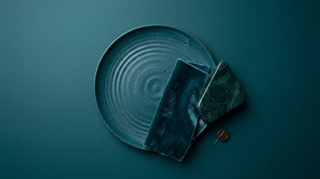
From stunning evening gowns to sleek jackets, this color pairs well with various fabrics. Think luxurious silk or textured velvet that adds depth and interest. Accessories like handbags or shoes in midnight green can elevate any outfit while adding a unique touch.
When styled effectively, midnight green can be combined with other shades for a striking look. It works beautifully alongside golds and metallics for an opulent vibe or paired with earth tones for a grounded aesthetic.
This color also transcends seasons; it’s suitable in spring as much as winter. Layering pieces in different shades creates visual intrigue while maintaining harmony throughout your wardrobe choices.
Midnight Green in Home Decor
Midnight green brings an elegant touch to home decor that few colors can match. It exudes sophistication and calm, making it perfect for creating serene spaces. Imagine a living room accented with midnight green throw pillows or maybe a cozy blanket draped over your sofa. This deep hue invites relaxation while offering a modern twist.
When used on walls, midnight green transforms any space into a luxurious retreat. Pairing this shade with warm wood tones creates balance and warmth, enhancing the overall aesthetic of your home. You might consider using it as an accent wall behind bookshelves or artwork to add depth and drama.
In bedrooms, it works wonders when combined with soft textiles like creamy whites or blush pinks. The contrast not only highlights the richness of the color but also promotes tranquility—ideal for unwinding after a long day. Think about incorporating this lush hue in bed linens or decorative cushions for added flair.
Don’t overlook smaller decor items either! Midnight green vases, candles, or picture frames can seamlessly tie together various elements throughout your home while maintaining that sophisticated vibe you desire.
Shades and Tones of Midnight Green
Midnight green, with its captivating depth, offers a range of shades that can evoke various moods and styles. The primary shade is rich and dark, resembling a deep forest at night. This intensity creates an atmosphere of sophistication and elegance, making it suitable for both modern and classic designs.
Lighter variations exist as well. These softer tones often blend hints of blue or teal, creating a refreshing yet grounded hue reminiscent of tranquil waters. Such shades are perfect when you want to achieve serenity without sacrificing style.
On the other end of the spectrum lies dusty or muted versions of midnight green. These colors appear more subdued, providing versatility in design applications while maintaining a connection to nature’s palette. They work beautifully in spaces where calmness is desired.
The beauty of midnight green lies not just in its singular charm but also in how it interacts with other hues. Every shade can contribute distinctively to your overall aesthetic vision—whether you’re aiming for bold statements or subtle elegance within your space or wardrobe.
Exploring Different Shades of #004953
Midnight green, represented by the hex code #004953, is a deep and captivating color that carries an air of sophistication. However, its allure extends beyond this single shade. There are various shades and tints of midnight green that can evoke different feelings and atmospheres.
For instance, lighter variations like teal or seafoam introduce a sense of freshness while maintaining the essence of blue-green hues. These softer tones are often used in design to create calming spaces or to complement brighter colors without overwhelming them.
On the darker end of the spectrum lies nearly black versions of it. These shades provide depth and drama, perfect for creating moody environments in both fashion and interior designs. The richness adds elegance when paired with metallics or vibrant accents.
Exploring these diverse shades allows designers to play with emotions effectively. Whether it’s through subtle shifts in tone on textiles or striking contrasts in graphic design, each variation offers unique opportunities for creative expression with midnight green as a foundational element.
Understanding Tones in Midnight Green Palette
The midnight green palette is rich and diverse, featuring various tones that evoke a sense of tranquility and depth. Each tone plays a role in how the color interacts with light and complements other hues. Understanding these differences can elevate your designs significantly.
Darker shades create an ambiance of sophistication, perfect for creating dramatic effects in both fashion and decor. They invite contemplation, making them ideal for quiet spaces or elegant evening attire. In contrast, lighter tones appeal to a more refreshing vibe, bringing vibrancy without overwhelming the senses.
When selecting tones within the midnight green spectrum, consider their emotional impact. A muted tone may convey stability and reliability, while brighter versions radiate energy. This versatility allows designers to tailor their choices based on intended feelings or themes.
Experimenting with different combinations enhances overall aesthetics too. Pairing tones can lead to unique contrasts that draw attention or subtle harmonies that promote warmth. By understanding how each shade influences your design narrative, you unlock new creative possibilities waiting to be explored.
Color Schemes with Midnight Green
It is a versatile color that can effortlessly enhance various designs. When paired with lighter hues, it creates a striking contrast that draws the eye. For instance, combining midnight green with soft pastels like blush pink or light lavender results in a fresh and sophisticated look. This pairing works beautifully in both fashion and interior design.
For a more dramatic effect, consider using it alongside bold colors such as mustard yellow or deep coral. These vibrant contrasts can invigorate any space or outfit, adding energy without overwhelming the senses. The interplay between dark and bright shades often sparks creativity.
Neutral tones also complement it wonderfully. Shades of beige, taupe, and gray provide balance while allowing this rich hue to stand out prominently. Using neutral backgrounds allows for versatility; whether you’re designing an elegant room or crafting outfits for different occasions.
Incorporating metallics into your color scheme offers another exciting dimension to midnight green’s depth. Gold accents bring warmth and luxury to the palette, while silver adds a sleek modern touch—perfect for creating an upscale aesthetic in any project.
Triadic Color Schemes with #004953
Triadic color schemes offer a vibrant and dynamic approach to design, especially when incorporating it (#004953). This rich hue pairs beautifully with two other colors spaced evenly around the color wheel. By choosing complementary shades, you can create striking contrasts that captivate the eye.
One effective triadic combination is midnight green with coral (#FF6F61) and mustard yellow (#EAB543). The warm tones of coral add a lively touch, while mustard yellow provides an earthy balance. Together, these colors evoke feelings of nature and freshness, making them ideal for creative projects or branding.
Another intriguing option features it alongside deep pink (#D5006D) and soft lavender (#9B59B6). This trio creates a sophisticated yet playful palette. The boldness of deep pink contrasts nicely against the calming nature of lavender, offering versatility in various applications.
When utilizing these combinations in your designs—be it graphic work or interior layouts—the key lies in balance. Ensure one color takes prominence while the others serve as accents. This strategy allows each shade to shine without overwhelming any single element within your design scheme.
Alternatives to Midnight Green
When considering alternatives to midnight green, there are several captivating options that offer similar depth and richness. One popular substitute is forest green, which evokes the tranquility of nature with a slightly lighter touch. It brings an earthy charm that works beautifully in both fashion and interior spaces.
Another alternative is teal, a color that combines blue and green tones for a vibrant yet soothing effect. Teal can infuse energy into designs while maintaining the serene quality associated with darker greens.
For those drawn to something more muted but still rich, pine green presents itself as an excellent option. Its soft undertones create warmth without overwhelming other design elements.
If you seek to explore beyond the spectrum of greens altogether, consider deep navy or charcoal gray. Both colors provide a sophisticated backdrop that complements vivid accents while embodying elegance akin to midnight green.
In your creative endeavors, don’t shy away from experimenting with these alternatives. Each shade offers unique attributes and can transform any project significantly while retaining that sense of calm sophistication found in midnight green.