
Greige Color Ultimate Guide of Trends and Home Design
When homeowners and professional interior designers search for the perfect neutral foundation, they inevitably encounter the sophisticated versatility of the greige color palette which has redefined modern aesthetics. This unique hybrid hue manages to bridge the gap between the stark clinical nature of traditional cool grays and the sometimes dated heaviness of classic sandy beige tones. By blending these two distinct color families, creators have developed a functional tool that adapts to shifting lighting conditions while providing a backdrop that supports diverse furniture styles and decorative accents. You will find that this specific pigment range serves as a chameleon in the architectural world because it maintains its structural integrity across various materials including matte paints, textured textiles, and polished stone surfaces. Understanding the subtle science behind these undertones is essential for anyone looking to renovate a living space or establish a cohesive visual identity for a new construction project.
The popularity of this specific shade stems from its remarkable ability to harmonize with both natural wood elements and industrial metal finishes without creating visual discordance or overwhelming the sensory experience. Many people appreciate how the warmth of the beige components prevents a room from feeling uninviting during the winter months while the gray influence keeps the space feeling airy and contemporary. To successfully implement this aesthetic, you should consider the following foundational steps:
-
Evaluate the primary light sources within your specific room.
-
Compare large physical swatches against your existing flooring materials.
-
Observe how the pigment shifts during different times of day.
-
Select a finish that complements the intended usage of the area. By following these methodical guidelines, you ensure that your chosen neutral remains timeless rather than becoming a fleeting trend that requires frequent updates or costly adjustments in the near future.
Defining the Scientific Composition of Greige Color
The technical essence of the greige color lies in the precise calibration of yellow-based browns and blue-based grays to create a balanced neutral. Chemists and paint manufacturers spend years perfecting these ratios to ensure that neither the warm nor the cool components dominate the visual field entirely during application. When you examine these pigments under laboratory conditions, you notice a complex layering of secondary colors that allow the eye to perceive depth where a flat gray would fail. This depth is vital for residential environments where flat surfaces can often appear two-dimensional or uninspired without the presence of subtle tonal shifts. Architects rely on this complexity to define structural lines while maintaining a soft atmosphere that encourages relaxation and comfort for the inhabitants within the home.
The practical implication of this scientific balance is that the color reacts dynamically to the Kelvin rating of your interior light bulbs. In a room featuring warm incandescent lighting, the beige elements become more prominent, providing a cozy and intimate feeling that suits bedrooms or private dens perfectly. Conversely, spaces flooded with natural northern light will bring out the gray side of the spectrum, creating a crisp and professional look ideal for home offices or kitchens. This adaptability means that a single selection can function effectively across different wings of a building while appearing unique in every specific context it inhabits. Real-world applications prove that this reliability reduces the stress of color coordination for busy professionals who need a foolproof solution for expansive open-concept floor plans or interconnected corridors.
The Historical Evolution of Neutral Palettes
Tracing the journey of neutral pigments reveals that the greige color emerged as a necessary correction to the extreme design trends of the late twentieth century. During the nineties, beige dominated the landscape to the point of saturation, often leading to interiors that felt muddy, yellowed, and trapped in a previous generation of design thinking. As the millennium turned, the industry swung violently toward cool grays, which offered a modern edge but frequently left homes feeling cold, sterile, and somewhat like commercial office environments. Design historians recognize that the synthesis of these two extremes provided a middle ground that satisfied the human desire for both modernity and organic warmth. This evolution reflects a broader cultural shift toward mindfulness and the creation of home environments that serve as peaceful sanctuaries from the digital world.
The relevance of this historical shift is found in the longevity of current design choices which now prioritize emotional well-being and visual longevity over rapid trend cycles. By choosing a hybrid neutral, you are participating in a design movement that values the architectural history of a space while keeping it relevant for contemporary lifestyle needs. This approach allows for the integration of heirloom furniture pieces with modern minimalist silhouettes without the two styles clashing or competing for dominance within the room. Professionally curated spaces now utilize these balanced tones to create a sense of continuity that honors the past while looking forward to future innovations. You will find that this historical perspective helps in justifying the investment in high-quality materials that will not lose their aesthetic appeal as shorter design fads inevitably fade away.
Analyzing the Impact of Natural Lighting On Greige Color
Natural light serves as the most significant variable when you are trying to determine how a greige color will actually appear on a physical wall surface. South-facing rooms receive consistent and warm sunlight throughout the day, which can make the beige undertones in the paint appear much more saturated and intense. This phenomenon requires a careful selection of a cooler version of the hue to prevent the room from feeling overly yellow or uncomfortably hot during peak daylight hours. Many designers suggest testing samples on multiple walls because the bounce of light from the floor can further alter the perceived temperature of the pigment. Understanding these optical physics is the key to achieving a professional finish that looks intentional and perfectly calibrated for the specific geographical orientation of your property.
The implication of lighting mastery is the ability to control the mood and perceived size of a room without changing any structural elements or expensive furniture. In north-facing rooms where the light is naturally bluish and dim, a warm-leaning neutral prevents the space from looking gloomy or perpetually shadowed by gray ghosts. This real-world relevance is especially high for residents in northern climates who experience long winters and limited daylight, as the right wall color can significantly boost indoor morale. By strategically choosing a shade that compensates for the lack of natural warmth, you create a vibrant environment that feels illuminated from within. This proactive approach to color theory ensures that your living environment remains functional and beautiful regardless of the weather conditions outside or the specific time of the year.
Comparing Cool and Warm Undertones With Greige Color
Distinguishing between the various temperatures within the greige color family is an essential skill for creating a cohesive and professional interior design scheme. Cool versions of this hue contain more blue or green base pigments, which give them a stony and sophisticated appearance that works well in modern galleries. Warm variations lean heavily into red or yellow bases, offering a creamy and soft texture that mimics natural linen or weathered sandstone in the sunlight. You must identify which direction your specific batch leans by comparing it against a pure white sheet of paper in the intended environment.
The relevance of this comparison becomes clear when you start introducing secondary colors into the room through upholstery, window treatments, and decorative art pieces. A cool-toned wall will beautifully complement navy blues, forest greens, and crisp silver hardware, creating a sharp and focused aesthetic that feels very contemporary. If you opt for a warmer neutral, you will find that it pairs more naturally with brass fixtures, terracotta accents, and rich cognac leather furniture. Making an informed decision here prevents the visual vibration that occurs when warm and cool elements are mismatched in a way that feels accidental rather than intentional. This level of detail differentiates a standard DIY project from a high- desk editorial space that looks like it belongs in a professional architectural publication.
Integrating Wood Tones with Neutral Walls
Wood flooring and cabinetry represent some of the largest visual surfaces in a home, making their interaction with the greige color a primary concern for designers. Honey-toned oaks and warm walnuts possess natural orange and red frequencies that can either be highlighted or neutralized depending on the specific wall paint chosen. A neutral with a strong gray component can provide a stunning contrast to warm wood, making the organic grain patterns of the timber stand out as a central feature. Conversely, a warmer version of the hue creates a seamless and harmonious transition that makes the room feel expansive and unified rather than segmented by high contrast. You must carefully evaluate the existing wood stains in your home to ensure that the wall color supports rather than fights the natural beauty of the timber.
This design synergy is particularly relevant for kitchen renovations where the cabinetry, flooring, and wall paint must exist in a delicate balance to avoid visual clutter. In a real-world setting, a well-chosen neutral can make inexpensive wood laminates look more luxurious and high-end by providing a sophisticated backdrop that elevates the entire material palette. This strategy is also useful for those living in older homes with original architectural details that they wish to preserve while modernizing the overall atmosphere. By using a hybrid shade, you respect the traditional elements of the wood while introducing a modern freshness that updates the home’s aesthetic for the current market. The result is a space that feels grounded in quality craftsmanship while maintaining a light and airy feel that is desirable for modern living and entertaining.
Psychological Effects of Balanced Neutrals On Greige Color
The psychological impact of the greige color is centered on the concept of equilibrium and the reduction of visual stress in the domestic environment. Unlike vibrant reds or deep blues that demand emotional responses, this balanced neutral provides a calm and steady background that allows the mind to rest. Color psychologists have noted that environments featuring these soft, earthy tones can lower heart rates and promote a sense of security and stability among inhabitants. This is particularly important in the modern era where many people work from home and require a space that facilitates both deep concentration and total relaxation. By eliminating the high-contrast distractions of more aggressive palettes, you create a versatile sanctuary that supports a wide range of daily activities and emotional states.
The implication for interior design is that the color choice directly affects how people behave and interact within a particular room or commercial building. In a living room, these soothing tones encourage longer conversations and a more relaxed posture among guests who feel immediately at ease in the space. In a bedroom, the lack of stimulating pigments helps to signal to the brain that it is time to wind down and prepare for a restful sleep cycle. This real-world relevance extends to the long-term enjoyment of a home, as residents are less likely to experience “color fatigue” with a neutral foundation. You are essentially investing in the mental health of the household by creating a visual environment that minimizes chaos and maximizes a sense of organized peace. This strategic use of color psychology is a hallmark of elite designers who understand that beauty and functionality must always be intertwined.
Maximizing Space in Small Apartments
For urban dwellers and those living in compact spaces, the greige color serves as a powerful tool for visually expanding the perceived square footage of a room. Light-reflecting neutrals have the ability to blur the lines between walls and ceilings, making the vertical dimensions of a space feel much taller than they actually are. Because this hue lacks the harshness of pure white, it doesn’t feel clinical or stark in tight quarters, but rather soft and inviting. The subtle gray undertones prevent the walls from closing in, while the beige elements provide enough warmth to keep the small space from feeling like a cold box. Using this color on both the walls and the trim can create a monolithic look that removes visual breaks, further enhancing the illusion of an expansive and open floor plan.
The practical implication of this technique is most evident in hallways and bathrooms where natural light might be limited and the physical footprint is extremely small. By applying a consistent neutral throughout these transition areas, you create a “flow” that makes the entire apartment feel like a single, cohesive unit rather than a series of disconnected cells. This is a common strategy used by real estate staging professionals to make small listings appear more valuable and spacious to potential buyers or renters. In a real-world context, this means you can live more comfortably in a smaller footprint without feeling cramped or overwhelmed by your surroundings.
The color essentially acts as a silent architect, reshaping the boundaries of your home through the clever manipulation of light and human perception. This efficiency is why the hue remains a top choice for developers and individual homeowners alike who are working with challenging or restricted interior layouts.
Coordinating Furniture and Textile Selections
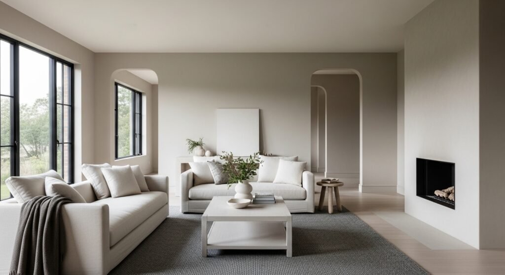
Selecting furniture to accompany the greige color requires an understanding of how different textures and materials interact with the subtle undertones of the walls. Linen sofas, velvet armchairs, and wool rugs all absorb and reflect light differently, which can change the way the wall color is perceived in their immediate proximity. For a sophisticated and layered look, you should aim to incorporate various shades of the same neutral family, creating a monochromatic scheme that relies on texture for visual interest. A chunky knit throw in a slightly darker taupe or a sleek leather chair in a sandy beige can add the necessary depth to keep the room from looking flat. This approach allows the furniture to feel like an extension of the architecture, creating a high-end custom look that is both comfortable and visually impressive.
The relevance of this coordination is that it provides a flexible foundation that can be easily updated with smaller, more colorful accessories as your personal tastes change over time. If you decide you want to experiment with trendy accent colors like terracotta or sage green, they will easily integrate with the neutral background without requiring a complete room overhaul. This real-world adaptability saves homeowners significant amounts of money and effort over the years while allowing their homes to evolve alongside their changing lifestyles. By treating the wall color as a permanent canvas and the furniture as movable art, you achieve a balance between long-term stability and creative expression. This methodical approach to decorating ensures that your home always feels current and curated rather than stuck in a specific design era. It is the secret to creating a “forever home” aesthetic that remains relevant and beautiful for decades.
The Role of Finish and Sheen Levels
The final appearance of the greige color is heavily influenced by the sheen level you select, ranging from flat matte to high-gloss lacquers. Matte finishes are excellent for hiding wall imperfections and providing a deep, velvety look that absorbs light and emphasizes the richness of the beige undertones. These slightly glossier finishes reflect more light, which can make the gray components of the color appear more prominent and crisp. You must balance the functional needs of the room with the aesthetic goals to ensure that the final result is both practical for your lifestyle and visually appealing under your specific lighting conditions.
The implication of this choice is that the same paint color can look like two entirely different shades depending on whether it is applied to the walls or the wooden trim. Many designers use a “sheen contrast” strategy where the walls are painted in a matte version and the baseboards and door frames are finished in a semi-gloss of the same hue. This creates a subtle architectural interest and a sense of sophisticated layering without the need for a secondary color that might disrupt the visual harmony of the space.
In real-world applications, this technique also helps to define the boundaries of a room and adds a touch of traditional elegance to modern minimalist designs. Understanding the physics of light reflection on different surfaces allows you to manipulate the atmosphere of a room with precision and confidence. This attention to technical detail is what separates a professional-grade interior from a standard home improvement project.
Popular Manufacturer Variations and Brands
When you begin shopping for the perfect greige color, you will encounter legendary shades from major paint manufacturers that have achieved cult status among interior designers. Brands like Sherwin-Williams and Benjamin Moore have spent decades refining their flagship neutrals to ensure they remain consistent across different batches and application methods. Some of the most famous examples include “Agreeable Gray” or “Revere Pewter,” each offering a slightly different balance of warmth and coolness to suit various architectural styles. Studying these established favorites allows you to see how the color performs in thousands of real-world homes before you ever crack open a single can of paint. You can find endless photographic evidence and reviews for these specific shades, which significantly reduces the risk of making a mistake in your own selection process.
The practical relevance of choosing a well-known manufacturer’s shade is the ease of touch-ups and the reliability of the color mixing process at the local hardware store. If you decide to expand your color scheme into another room three years later, you can be confident that the formula will remain the same and match your existing walls. Furthermore, many of these popular shades have “companion palettes” suggested by the brands, which take the guesswork out of choosing trim colors or accent hues.
This is especially helpful for those who feel overwhelmed by the thousands of options available on a standard paint deck and want a proven winner. By relying on the research and development of these major companies, you are leveraging professional expertise to guarantee a high-quality result in your own home. This accessibility has democratized high-end design, allowing anyone to achieve a sophisticated look regardless of their professional background or experience in the field.
Exterior Applications Of Greige Color for Curb Appeal
The utility of the greige color extends far beyond the interior walls, as it has become one of the most popular choices for modern residential exteriors. When applied to siding, stucco, or brick, this neutral creates a sophisticated and timeless look that blends harmoniously with the surrounding landscape and natural environment. It provides a more contemporary feel than traditional white or beige but is far more forgiving in direct sunlight than dark charcoals or blacks which can fade or cause heat absorption issues. An exterior finished in this hue looks clean and well-maintained, significantly boosting the curb appeal and potential resale value of the property. It also serves as an excellent backdrop for landscaping, allowing the vibrant greens of trees and the colorful blooms of flowers to stand out as the primary visual focus.
The real-world implication of using a hybrid neutral on your home’s exterior is the long-term maintenance benefits and the broad appeal to future buyers. Lighter shades of this color family reflect UV rays more effectively, which can help to protect the integrity of the siding material and keep the interior of the home cooler during the summer months. Furthermore, because it is a “safe” yet stylish choice, it rarely conflicts with neighborhood homeowners association guidelines or the architectural style of surrounding houses.
This makes it a smart investment for those who want to update their home’s look without taking a significant aesthetic risk that might alienate certain demographics. Whether you are painting a traditional farmhouse or a modern coastal retreat, this color provides a professional and polished finish that stands the test of time and weather. It represents a bridge between the architecture and the earth, creating a sense of belonging for the structure within its specific site.
Transitioning Between Different Rooms
Creating a cohesive flow throughout a home is one of the most challenging aspects of interior design, but the greige color simplifies this process significantly. By using varying strengths or “percentages” of the same base neutral, you can create a sense of movement that feels intentional and carefully choreographed. For example, a darker, more dramatic version of the hue can be used in a formal dining room, while a lighter, airier version can be used in the connecting hallways and living areas. This maintains a consistent “thread” that ties the entire floor plan together while still giving each individual room its own unique personality and atmosphere. This technique prevents the jarring experience of moving from a bright white kitchen into a dark brown living room, which can often make a house feel disjointed or smaller than it is.
The relevance of this transition strategy is found in the way it handles the visual “sightlines” of a modern open-concept home where multiple rooms are visible at once. When you stand in the kitchen and look through the living room toward the entryway, a unified palette ensures that the eye moves smoothly across the space without being interrupted by clashing colors. This creates a sense of peace and order that is essential for a high-functioning home environment where multiple activities happen simultaneously.
In real-world terms, this also makes the process of decorating much easier, as you can move furniture and art from one room to another without worrying about whether they will match the new wall color. This flexibility is a major advantage for families whose needs change over time and who frequently repurpose different areas of their homes. A cohesive neutral foundation is the ultimate tool for a versatile and adaptable living space.
Lighting Temperature and LED Selection
As the world transitions toward energy-efficient LED lighting, understanding how different bulb temperatures affect the greige color has become a critical skill for homeowners. Lighting is measured on the Kelvin scale, with lower numbers like 2700K being very warm and yellow, and higher numbers like 5000K being cool and daylight-mimicking. If you use a warm bulb, your neutral walls will lean heavily toward the beige side, potentially looking almost tan in the evening hours when the lights are at full strength. Conversely, “cool white” or “daylight” bulbs will pull the gray tones to the forefront, which can sometimes make a room feel a bit sterile or blue if not balanced with warm furniture.
The implication of this technical knowledge is that you can essentially “tune” your room’s atmosphere simply by changing your light bulbs rather than repainting the entire space. This is a highly cost-effective way to refresh a room’s look or to adjust for the changing seasons when the natural light outside shifts in quality and duration. In a real-world scenario, you might choose warmer bulbs for bedrooms and living rooms to enhance coziness, while using cooler bulbs in laundry rooms or garages where clarity and a crisp look are more important.
Being aware of this interaction prevents the common disappointment where a color that looked perfect in the store looks completely different once installed in your home. This level of environmental control is a key component of modern luxury living and high-end interior styling.
The Longevity of the Greige Color Trend
One of the most frequent questions regarding the greige color is whether it is a passing fad or a permanent fixture in the world of interior design and architecture. Unlike the “millennial pink” or “avocado green” trends of the past, this hue is rooted in the fundamental principles of neutrality and balance, which tend to have much longer lifecycles. It functions as a foundational element rather than a decorative accent, meaning it serves a structural purpose in the visual hierarchy of a room that is not easily replaced. As long as people desire homes that feel both clean and comfortable, there will be a place for a color that effectively combines the best attributes of gray and beige. It has become a new standard in the industry, much like “off-white” was for previous generations, providing a reliable starting point for almost any project.
The relevance of this longevity is primarily financial, as painting a home is a significant investment of both time and money that most people do not want to repeat every two years. By choosing a color with proven staying power, you are protecting your investment and ensuring that your home remains attractive to the widest possible audience should you ever decide to sell. In the real world, this means you can spend your budget on high-quality furniture, art, and landscaping, knowing that your wall color will continue to provide a sophisticated backdrop for years to come.
This stability allows for a more slow and considered approach to decorating, where you can collect pieces over time that truly reflect your personality rather than rushing to keep up with a fast-moving trend. It is the ultimate “slow design” choice that prioritizes quality, comfort, and enduring style over the superficial whims of the fashion cycle.
Impact on Resale Value and Real Estate
In the competitive world of real estate, the greige color has emerged as the gold standard for preparing a home for the market because of its universal appeal. Real estate agents frequently recommend this specific palette to sellers because it allows potential buyers to easily visualize their own furniture and lives within the space. Unlike bold or highly personalized colors that can be polarizing, a balanced neutral feels like a “blank canvas” that is still warm and inviting enough to feel like a home. This often leads to faster sales and higher offer prices, as the property looks modern, well-maintained, and move-in ready without the need for immediate renovations. It bridges the gap between different generations of buyers, appealing equally to younger professionals seeking a modern look and older buyers who appreciate a more traditional warmth.
The implication for homeowners is that choosing this palette is a strategic financial decision that goes beyond simple aesthetics and enters the realm of asset management. Even if you have no plans to sell in the near future, maintaining a home that adheres to high-quality design standards ensures that you are building equity in a way that is widely recognized. In real-world staging scenarios, this color can hide architectural flaws and highlight positive features like high ceilings or intricate crown molding by providing a consistent and non-distracting background.
It essentially acts as a professional filter that makes every room look its best in both online listing photos and in-person tours. By removing the “work” of repainting for the buyer, you are removing a significant psychological barrier to purchase, making the entire transaction smoother and more profitable. This is why the hue remains a top recommendation from interior designers and real estate professionals across the globe.
Case Studies Of Greige Color in Modern Architecture
Examining modern architectural masterpieces reveals that the greige color is frequently used to soften the hard lines of concrete, steel, and glass structures. In contemporary homes where large windows and industrial materials are common, this neutral provides an essential organic element that prevents the building from feeling too cold or detached from nature. Many world-renowned architects use this palette to create a seamless transition between the interior of a home and the outdoor landscape, often matching the paint to the natural stone or soil found on the site. This creates a sense of “belonging” for the structure, making it feel like an extension of the environment rather than an imposition upon it. These case studies prove that the color is not just a residential paint trend, but a serious tool used in the highest levels of global design to achieve balance and harmony.
The relevance of these architectural applications is that they provide inspiration for everyday homeowners who want to achieve a high-end, custom look in their own spaces. You can adapt the techniques used in luxury villas and modern museums—such as using a single neutral to unify diverse materials—to make your own home feel more curated and intentional. In real-world settings, this might mean matching your wall color to your stone fireplace or your exterior stucco to the surrounding gravel paths. This level of integrated design creates a powerful visual impact that feels both sophisticated and deeply grounded in its specific location.
By studying how professionals use these tones to manipulate light and shadow, you can gain a deeper appreciation for the versatility and power of a well-chosen neutral. It is a testament to the idea that simplicity, when executed with precision and care, is the ultimate form of sophistication in the built environment.
Advanced Color Theory and Pairings
To truly master the use of the greige color, one must look beyond the walls and consider the advanced color theory of “tertiary harmony” and contrasting accents. While the hue is a neutral, it still possesses a position on the color wheel that dictates which other colors will create the most pleasing visual relationships. For instance, pairing a warm neutral with a deep navy blue creates a classic, high-contrast look that feels both nautical and traditional. On the other hand, pairing a cooler version with soft lavender or sage green can create a serene, spa-like environment that is perfect for relaxation and meditation.